1. In what ways does your media product use, develop or challenge forms and conventions of real media products?
My media products conform and challenge the stereotypes of music magazines. The research of realism print products has helped me to find out the codes and conventions of music magazines; I was able to then understand the sterotypes and start producing a product that would appeal to my audience.
I chose to aim my product at young teenage girls who enjoyed pop music. I did research to find out the conventions and looked at similar products such as Top of the Pops and Smash Hits. These magazines use pink as their main colour scheme. I have followed this convention and used pink as my housestyle, alongside shades of purple and white. These colours will represent my magazine and target audience.
The layout of my magazine is simple. The stereotypical pop-based music magazine would have a front page which is crammed full of stories and pictures. I challenged this image by allowing a maximum of two images on the front page. I have use one mid-shot image as my background and for the main article. The mid-shot shows a typical girl dressed quite casually. I am trying to represent that you don't have to be skinny and beautiful to be a star. This image will represent every single female that reads my magazine and I want to put that statement across.
The contents page is also much more simplistic than stereotypes. I have used three images, an editors note and contents. These images are quite candid and personal to the cover star. I have collected images that belong to Jess that I am going to use to open up the interview. I have kept to the colour scheme of pink and purple and used the font from the magazine cover. I used the font called ElizaJane. This is quite a girly font which uses hearts for its commas, full-stops and exclamation marks. I used this text to write the editors note as I believe it makes it feel more personal to the reader. The text I used at the bottom of the page is more of a solid font. This is called Felix Titling. It is quite a serious font and I have used it for most of the quotes and titles. If I was to change anything, it would be the layout of the contents page.
My double page spread features one image on the right. Stereotypical double page spreads feature one image, therefore I am conforming to this. However, this photo is always posed and looks fake sometimes. I have decided to go for a more relax and be-yourself photo. This also makes the article feel more open to the readers. I justified the text I have written, so that it is clear to read. The quote that I have used at the top of the page reads "I'm nothing like what the magazines say...". I chose this quote because I thought it would represent an individual and normal teenage girl who is criticised for doing what she loves. Most people don't understand how the press can manipulate the lives of celebrities. My magazine will not be doing this as the manipulation mostly takes part in the magazines which are focused of gossip and fashion.
My media products conform and challenge the normalities of music magazines.
2. How does your media product represent particular social groups?
I wanted my magazine to represent the average girl and inspire teenagers to go for a dream; even if that saying is a cliché. I chose to aim my magazine at teenage girls that enjoy pop music. I have done this as I feel there is a gap in the market for this age group - however I will discuss this later. The representation of my media product shows that normal girls can become stars and as I mentioned earlier, the whole Californian girl with blonde hair and blue eyes is just a sterotype. Anyone is beautiful. My magazine would love to boost the self esteems of those girls that feel that they aren't like the others. From my double page spread, the article about Jess says that girls shouldn't conform to the contemporary pressure. My character, Jess, is the perfect role model for the target audience of my magazine.
3. What kind of media institution might distribute your media product and why?
I would like to think that the BBC Magazines would distribute POP! as part of their magazine collections. Although they already own Top of the Pops, a magazine which elaborated from a TV series which focused on all genres of music, I believe there is a gap in the market for another teenage pop music magazine. The range that BBC Magazines for teenagers is very small and that having an older-teenage group as the audience for a magazine would benefit their range.
4. Who would be the audience for your media product?
I have decided to aim my magazine at girls aged between 12 and 16. I have chosen this market as I believe the current magazines that are available are fairly childish. The publishers have tried to produce a really childish magazine by using small words and lots of pictures. I think the market needs a magazine for this age group which is more mature. Although I have kept the use of pink and purple which represent the young audience, but I have tried to make it more mature by adding in solid fonts such as Felix Titling.
5. How did you attract/address your audience?
I attracted and addressed my audience by using bright colours and text effects which allow the pictures, text and boxes to stand out from the page. The drop shadow tool allowed my magazine to look more effective that others. The use of space also allows the reader to go through the information without being overloaded with articles and images.
I decided to use buzz words which would capture the readers eye. I also noticed when doing my research that these genre of magazines use a lot of exclamation marks. The two of these combined work well together, and capture the readers interest.
I decided to use an informal style of language in my magazine, as I feel that this will make the reader feel like a member of the magazine 'team'. The coloquial style also means that readers will understand the language style used, and will not be confused by any large or ambigiuous words that I use.
I also chose to use images which were quite bold. I removed the background which was dull and grey and replaced it with a gradient pink background. Although I think this was too bright and I would reconsider this option if I was re-doing this project. The colours I used for my magazine were chosen to attract my target audience, 12-16 year old girls. I feel the colours I chose worked well, as pink and purple are colours stereotypically associated with girls and femininity.
6. What have you learnt about technologies from the process of constructing this product?
Throughout the creation of this project, I have learnt to use software such as Adobe Photoshop and Adobe InDesign. These are going to help me when I come to create my print for A2.
Photoshop allowed me to manipulate images. I was able to use the dodge tool to whiten teeth and eyes. I was also able to use tools such as the clone tool to remove spots and blemishes. All of these tools allow me to create the "perfect" image of the characters. Although I wanted to create an image that anyone can be beautiful, I wanted to create this image to represent the flawlessness of stars.
I was able to change eye colour, lip colour and over facial features. This allowed me to change colours and contrasts to even out the photo; for example I changed lip colour as I thought Jess' lips were quite pale. I made them pink so they fitted in with the housestyle too.
When putting my media product into InDesign, I found out that for future reference I will need to be aware more of bleed marks; this is because I lost part of my double page spread.
7. Looking back at your preliminary task, what do you feel you have learnt in the progression from it to the full product?
My preliminary task allowed me to gain experience with Photoshop and learn how to use all of the tools. I was however quite pleased with my college magazine. The main advantage of a preliminary task it that I was able to learn how to use products in full, so that my experience would be brilliant when it came to the full product.
I was also able to research the codes and conventions and learn how the layouts are stereotypically done throughout magazines. Also, I was able to see the whole range of texts and begin to look at what I could use for my full product. The images I could use were also important. I began taking photos for my full product and comparing them with the college magazine. I looked at the contrast and found out how much more that music magazines are more glamourous.
Tuesday, 7 December 2010
Final Product - Double Page Spread

My double page spread features an interview with my cover star, Jess, and an image. I decided to use a photo which would represent the character I was interviewing. Most music magazines have the cover star all airbrushed and dressed up but I wanted to go for a more casual effect. I think this worked.
I justified the text so I could clearly put them into coloumns and also so the reader can see who is talking in what section. I also bolded the title of the persons name/initials who was talking.
I decided to put a large title quote to captures the readers attention. A ellipses lets the reader think that a quote isn't finished and they want to see what else they said. I chose the quote "I'm NOTHING like what the MAGAZINES say...". I chose this because most people who are featured in the press can recieve harsh critism, so why should it be such a perfect world in the stereotypical girls magazine. I gave a drop shadow on the text to make it stand out more. I also decided to bold the words "nothing" and "magazines" as I believe these are the important words in the magazine, and the two words that the interviewee character would emphasise.
Like on the contents page, I have put the page numbers in small white drop shadow boxes. This makes them stand out clear. However, if I was to do this again, I would leave space for them.
When I put this into InDesign, I had a small section cut of due to the bleed of the page. In the future I will be more aware of the bleed.
Final Product - Contents Page

This is my contents page for the music magazine POP! I have chosen to challenge the stereotypes by sticking to no more than three images on this page. I have still used the housestyle from the front page. On the left, I have positioned the contents of the magazine. I have put it there as I believe it will be the first thing people read.
Next to the contents, I have inserted an editors note. This conforms to the stereotypes of the girly magazine genre. I have kept the elizajane font for this editors note as I believe it looks quite similar to handwriting and makes the message feel more personal. If I was to change anything about the editors note, I would say that I should've changed the "Hey readers!" to "Hey Reader!". This also makes the note feel person if it is addressed to one person.
The white box which I have put around the text makes the article about Jess stand out. The drop shadow gives and effect of it coming off the page. This makes the page look more interesting and I have decided to do the same with the page number.
I collected some personal images of Jess and her friends which I can use in her interview. I decided though to use them on the contents page so I could use the posed ones for the interview article. This relaxes the reader and makes them feel as if they could know Jess personally.
I also took some photos of Ruth to use as another article on this page. The article relates to her being the only female in the band, and therefore she will give her female opinions.
I have challenged the convetions of girly magazines by not including anything too exciting about "hot lads". Although I have mentioned it in the contents.
Final Product - Front Cover

This is my front cover for the magazine POP! I have decided to target my magazine at young teenager girls that are interesting in pop music and gossip. Like most magazines with the genre, I have tried to conform to the codes and conventions, however, I have challenged the stereotypes. Most magazines with this genre have a front page full of puffs and pictures, but I decided to go for a more relaxed and not-so-in-your-face view.
I have kept to the girly focused colour scheme of pinks and purples. This conforms to the stereotypical female based magazines. The image I have taken has been manipulated as I have changed Jess' lip colour as they were quite pale. I have also filled in her should (on the right) as there was originally someone elses hand there.
The text I chose reflects on the girly style. It is called ElizaJane. I used it for the masthead as the hearts could then be associated with the magazine image. The girly hearts will make teenage girls more interested, along with the free give aways - such as the free poster which is advertised in the top right hand corner.
I originally left the magazine cover as it was without the story that was in the bottom right hand corner, but I felt that it made the page look too bare.
House Style
FRONT PAGE
Masthead
Font: Eliza Jane
Size: 130pt
Colour: #ED145B (Hot Pink)
Other: Exclamation mark is a different colour (#AF006F, dark purple) and drop shadow.
Tag Line
Font: Arial
Size: 14pt
Colour: #ED145B (Hot Pink)
Other: N/A
Puffs
Font: Arial
Size: 18pt
Colour: #ED145B (Hot Pink)
Other: N/A
Main Article Title
Font: Felix Titling
Size: 36pt
Colour: #AF006F (Dark Purple)
Other: N/A
Main Image
Mid-long shot of a female wearing casual clothing. This is to go against the conventions of pop magazines and “glamming” up the cover star.
CONTENTS PAGE
Title
Font: Felix Titling
Size: 26pt
Colour: #AF006F (Dark Purple)
Other: POP! will be in the font Eliza Jane, size 24pt.
Editors Note (Possibility)
Font: Eliza Jane
Size: 18pt
Colour: #ED145B (Hot Pink)
Other: N/A
Contents
Font: Arial
Size: 22pt
Colour: #000000 (Black) and #ED145B (Hot Pink)
Other: N/A
DOUBLE PAGE SPREAD
Title/Quote
Font: Felix Titling
Size: 30pt
Colour: #000000 (Black)
Other: Drop Shadow
Image
Close up of cover stars face. As less editing as possible as I want to ensure the casual approach from the front is still solid throughout.
Text for Article
Font: Arial
Size: 14pt
Colour: #000000 (Black)
Other: Justified Text
First Draft

This was my first draft for my magazine. I had changed from what I wanted to produce, and move the image and puffs. I decided to re-create a new front page however as I tried to edit the background colour and it didn't work very well. Also, the title makes the magazine look empty and not like the crowded codes that music magazines use. However, I liked the way I had changed Jess' lip colour and where the magazine feature was.
I kept to this colour scheme for the re-creation of my music magazine as I think my draft looked more like a fashion magazine.
Choice of Images

For my music magazine I took plenty of photos to choose from. I took shots from all angles and then decided on which would look best. I chose Jess as my model as I believed she would be a stereotypical female role model for the front cover. I also though I could write an amazing article based on her character.
Magazine Mock Ups

Above I have done a mock up of my front cover and contents page. I have chosen the main colours as pink and purple as this goes with the codes and conventions of pop music magazines. I have also decided to call my magazine POP! as it is short, yet sweet, and will capture the readers eye. The font I will use is girly and uses a heart for the exclamation mark. As I will be using a lot of exclamation marks, this technique will combine the conventions and add an effect.

My double page spread will have a main image on the right and text on the left. This goes against the conventions of a pop music magazine as most have lots of small images and lots of text. Most magazines have this format, but they are rock magazines. Also, fashion magazines do this. Going against the conventions will keep the girly glamour but change the format of the stereotypical music magazine.
Target Audience
 My target is audience will be for girls aged 12 – 16. I have researched and looked into the codes and conventions of music magazines and have decided to go for a teenager “pop” approach.
 There aren’t many girly music magazines in the market current as this is dominated by rock and metal magazines. Some examples of girly magazines are Top of the Pops which is owned by BBC Magazines and Smash Hits. Both of these magazines promote the Pop Sector of music magazines. The front pages of them are jam-packed full of puff’s which attract the young audience. They use words like “Hot stuff” and “Phwaor”. The use of exclamation marks makes every word and sentence exciting.
 I have chosen this target audience as I believe I can create a pop music magazine with all the conventions of the magazines in the current market, but slightly alter it, so there isn’t so much information on the front cover, contents or double page spreads.
 Monday, 6 December 2010
Codes and Conventions

Music magazines have different codes and conventions compared to other genre's of magazines. The four main points of a magazine is the layout, image, text and audience profile. Top of The Pops is a very girly orientated music magazine that focuses on pop music. It digressed from a hit tv series which broadcasted the latest music artists and bands.
Most of the magazines use a colour scheme of pink and purple. These are very girly colours which connote that the target audience is girls. However, this is stereotypical. Most of the magazines with this format are very crowded and full of gossip and information; that is actually really pointless. They also feature real life stories which interest the audience.
The language used could also represent the age of the audience. The magazine uses very simple words and lots of exclamation marks. These are to make the reader more excited and interested.
The font they use for the puffs is clear and I would say it is Sans Serift. They have bolded words that they want to stand out and italiced any quotes.
Top of the Pops has a very gender specific image on the front cover to attract the potential audience. Most of the covers use male role models and they do this to encourage the girls. This is because most of the male role models are their teenage crushes.
After looking at the codes and conventions of teenage girl magazines, I have found some ideas which I could use for my magazine.
Questionnaire Results

I asked my interviewees if they were male or female. As I wanted to aim my magazine at females, I asked more women. This means I would get more female opinions. This will help me understand the demand of my audience.

I also asked the respondents how old they were. My target audience will fit into the 10-18 category so I was able to get some opinions from females between the ages of 10-18.

A music magazine will consist of music, obviously. So I asked my audience whether or not they were interested in music. If they were not, they wouldn't have any intentions of purchasing a music magazines.

I then asked which types of music people listen to. The majority of respondents said pop. It seems that most people prefer pop music compared to others. I asked some interviewees why they said this. One said "...because pop music is much more interesting. I love reading music magazines that talk about pop-focused bands."

Music magazines can be sold weekly, fortnightly and once a month. I asked how often do my potential customers buy music magazines. This will also help me decide on how often my magazine would be sold. It appears people generally buy magazines once a week and sometimes once a month.
Penultimately, I asked what people look for when they buy a music magazine. Most respondents said that they enjoy reading the articles. One person said "...I love reading articles about my favourite bands. It's interesting to find out what their lives are like..."

Finally, I asked the respondents to tell me what each colour could represent. This is what they told me. It seems that pink and purple would connote girly-colours very well. I will then use this for my magazine.
Questionnaire
Are you male or female?
□ Male □ Females
Which age bracket do you fit into?
□ 10-18 □19-26 □ 27-35 □ 36 -44 □ 45-53 □ 54+
Do you listen to a lot of music?
□ Yes □ No
What are you favourite genres of music? (Pick 3)
□ Rock □ Pop □ R’n’B □ Grime □ Rap □ Classical
□ Indie □ Techo □ Acoustic □ Country □ Punk □ Blues
□ Jazz □ Dance □ Metal □ Electro-pop □ Folk □ Hip-hop
□ Soul
How often do you buy music magazines?
□ Once a day □ Once a week □ Twice a week □ Once a fortnight
□ Twice a fortnight □ Once a month
Which music magazines do you know from the list below? Select as many as you know.
□ Top of the pops □ NME □ Kerrang! □ Q
□ Rolling Stones □ Blender □ Music □ Mojo
□ Vibe □ Billboard □ Uncut □ The Wire
□ Rock-a-Rolla □ SPIN □ Smash Hits
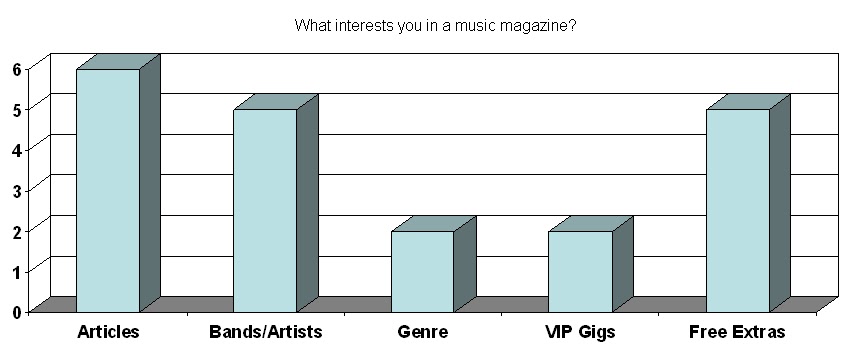
What interest you in a music magazine?
□ Articles □ Bands/Artists □ Genre □ VIP Gigs □ Free Extras
□ Other: ______________________________
What do you think each colour represents?
Red: __________________________ Aqua: _________________________
Orange: _______________________ Blue: __________________________
Yellow: ________________________ Purple: ________________________
Green: ________________________ Pink: __________________________
Florence and the Machine - Q

Q magazine is an established monthly magazine which focuses on popular music artists. This issue features award winning rising star Florence Welch. Florence
The article talks about Florence ’s venture into the USA Florence
The script text used in the title and the article suggest a classy side and represent that Florence
In the article, her name is coloured in Blue. This is because the American flag has blue and white stars, and this is not seen on the flag she is seated on. The blue stands out as it goes against the colour scheme of the page.
In the rule of thirds, the first thing the audience see is the wording “USA ” and Florence
Miley Cyrus - Billboard

This is a double page spread from Billboard magazine. Featured is Miley Cyrus. She is the main article in the magazine, as she is on the front cover too. This page focuses mainly on what the article is about – I would assume that there is another double page spread which gives more information.
Following the conventions of other music magazines, Miley Cyrus is the main person of this spread. The text is written in a basic font, similar to Arial and in capitals. The word ‘Girl’ is highlighted in pink. The colour pink could connote words such as girl and young. This is quite a ‘Hot’ shade of pink and could connote a more teenager style. Miley is wearing black clothing for the shoot and this makes the single pink colour stand out from the rest – however, when I asked my peer, they told me that they thought the solid black text stood out more. She said that the pink at the side wasn’t as noticeable and that she saw the black text first over everything else. This is to do with the text being in the centre of the double page. Also, the concrete walls for background could connote a cold room or quite a plain background.
The photo is a long shot of Miley Cyrus sat on the floor to the left. Referring to the ‘Rule of Thirds’, she is positioned more towards the left, and this is where the eye sees first – we read from left to right. They have put the main text on this page to the right, so it is the last thing you read. On the left page, Miley’s face is in the centre of the third with the word ‘GIRL’, where as on the right page, nothing is really in the centre of the page, but the first thing the eye notices is the follow-on to the word ‘GIRL’ with “..YOU’LL BE A WOMAN SOON”. This connotes that she has grown up.
For people that know who Miley Cyrus is, she has always been known as a young, naïve Disney star, but recently this year, she released her new album ‘Can’t Be Tamed’ which shows a more “sexy” side to her. Her outfit compliments this statement. The way she is positioned in the actual photo and the pose she is doing makes her come across as quite a ‘sex icon’ for the teenage world.
Jonas Brothers - TOTP

Top of the Pops is a BBC show where top music acts perform their music weekly. A few years back, everyone would gather around their television sets on a Friday night to watch the show; it was very popular. In 1995, BBC decided to product a print magazine of the TOTP show, with interviews from the biggest stars and real life stories. It began much in the mould of Q magazine, and then changed its editorial policy to directly compete with popular teen celebrity magazines such as Smash Hits and Big, with free sticker giveaways. It is now a monthly magazine which features chart information, star gossip and fashion.
To the left is an edition from 2009 and stars on the front “teenage heart-throbs” the Jonas Brothers. The three brothers make up a Disney owned band which produces music that the young girls love. This magazine is aimed at young girls aged between 8 and 14 and with the band starring on the front of the magazine; it will encourage this generation to buy it. The titles “No more secrets! – Jonas Brothers come clean about everything” makes the reader think that there is things that the audience doesn’t know, making them feel inclined to buy the magazine.
This front cover is crammed with gossip and “top stories” that will interest the target audience. The language used is simple – such as “OMG!” and “Exposed”. It is also written in capital letters to stand out more. With words like these, they interest the reader.
Subscribe to:
Comments (Atom)